
“Graphic” by Katie Freeman, courtesy of the Butler University website.
KATIE FREEMAN | CO-OPINION EDITOR | kmfreema@butler.edu
As you may have noticed, the Butler University website recently became the unfortunate recipient of what I presume was meant to be a makeover but ultimately bears more resemblance to a botched facelift. In other words, it got a rebrand.
If you told me to name a pressing issue that would be worth Butler University spending my precious tuition dollars on to fix, I could give you a slew of more worthwhile options. Perhaps the campus water drainage systems could use an overhaul. A few extra parking spots wouldn’t hurt. Better yet, what if the food in Atherton was actually stomachable?
Apparently, none of those potential projects were nearly as critical as rebranding the website — an endeavor that could apparently cost anywhere from $40,000 to $75,000. In my not-so-humble opinion, that money would be better spent on, well, anything else.
But no — the power of Butler’s marketing and communications team oh-so-sauvely squeezed this update into the university budget, neglecting the possibility of improving the campus experience in favor of baiting prospective Bulldogs via a brand refresh.
I personally do not frequent butler.edu, but I don’t recall ever running into any notable issues on the site. It wasn’t buggin’ out, and it certainly did not assault my eyeballs with an onslaught of unnecessary transition effects like it does now.
Forgive me for my incessant negativity, but the website looks like the digital equivalent of an overflowing Chipotle bowl crafted with every possible ingredient, plus extra guac — it just has way too much going on.
Seriously, if you haven’t checked out the new website, do it right now.
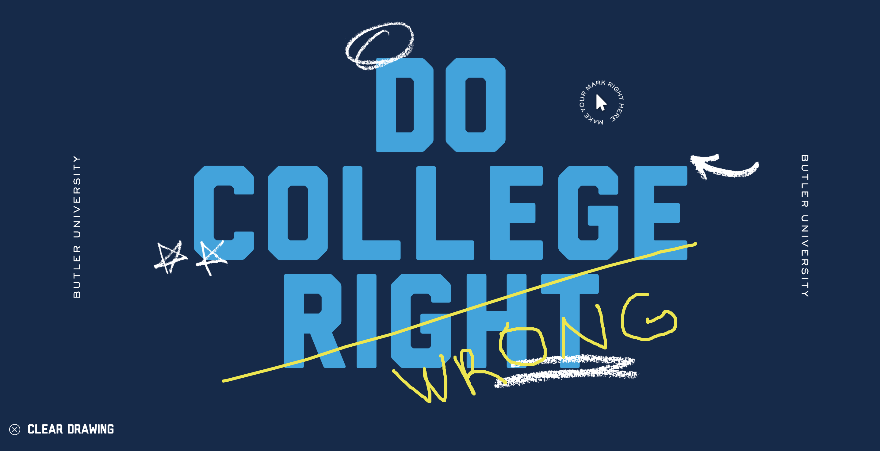
Upon opening the website, you’ll find a huge banner that encourages students to “DO COLLEGE RIGHT.” This aggressively-presented suggestion comes alongside several key details: some scribbled stars and arrows that look like free Canva effects, a rotating circle of text surrounding your cursor reading “Make your mark right here,” and the ability to doodle on the page in yellow ink, which somewhat quenches my barely-contained desire to vandalize Butler property.
First of all, nothing about chalkboard-looking scribbles screams “higher education” to me. As a strategic communication major, this does raise some concerns about the quality of the branding techniques I was taught in class. But who knows, maybe I should be taking notes. Maybe I’ll take them on the butler.edu homepage.
Once you’ve doodled your heart out, you’ll find that hovering your cursor over just about any link button on the page highlights it in neon yellow and triggers yet another horrendously garish chalk animation.
From there, the site invites incoming students to start their personalized degree by typing in a word related to whatever they hope to study. Solid feature, save for the fact that a search for “writing” suggests German, strategic communication and sports media as potential majors before journalism. Sigh. It’s okay, I already knew my major was going to supply me with a post-grad salary no more useful than a fistful of Kohl’s Cash.
Keep going, and you’ll become subject to viewing the most visually jarring transition I have ever seen in my life. Seriously, it’s downright treacherous. Text flies in from both sides. A promotional video zooms away as you scroll. Right when you think it’s over, a stupid little chalk doodle of the Butler flag enters from the bottom, affixing itself over the video like an ugly bumper sticker.
Skip the stories section. We’ll gloss over the second instance of adding rotating text around the cursor — which is downright dizzying to read — in favor of analyzing the very last section of the Butler homepage.
At the bottom of the website resides an image gallery. As your cursor hovers over photos, they dance around the screen, squirming erratically like a child that must use the bathroom expeditiously. Now, graphic design is by no means my passion, but there has got to be a better way to display a photo gallery. The images don’t have to move. Not everything has to move.
The cherry on top? Three more chalky Canva-esque doodles superimposed on top of the gallery. Go hard or go home, I guess.
I just have one question: Was it worth it, Butler?
Of all the issues on this campus, focusing on the aesthetics of the website seems a tad bit tone-deaf — especially given the quality of the end result. At no point in my life have I ever felt a stronger desire to purchase a pair of blue-light glasses than I did after scrolling through this homepage. Please — tone it down. I’m begging.